


Branding · 17 August 2026
How to Make Your Brand Feel Premium and Charge More
Premium brands sell plain products at outrageous prices by borrowing associations, not by outspending anyone. The four ways they do it, and how to audit what your own brand is standing next to.
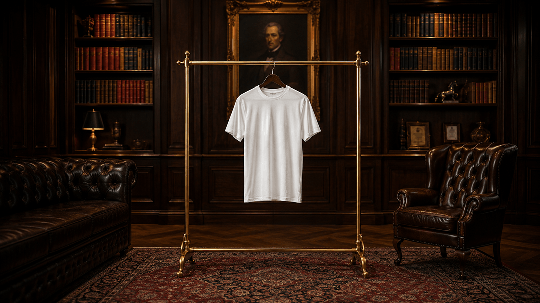
You don't need hundreds of thousands in paid ads. You don't need a celebrity co-sign, although it helps. You don't even need a better product than everyone else in your category.
What you need is a better set of associations.
Rory Sutherland has spent most of his career making a version of this argument: the value of something isn't held in the object itself, it's held in the context you place it in. Change the context and you change what people are willing to pay, without touching the product at all. Once you start looking at premium brands through that lens, you notice almost all of them are running the same play.
I call it parasite branding. Your brand attaches itself to something with existing equity and borrows meaning from it. Not counterfeiting, not copying. Borrowing.
Here's how it works, what it looks like in practice, and how to work out what your own brand is currently borrowing from.
The principle: nobody values anything in isolation
People are terrible at judging absolute value and very good at judging relative value. Ask someone what a cotton t-shirt is worth and they'll struggle. Show them the same t-shirt on a shelf between two £600 pieces, shot in a certain light, sold in a certain room, and the number arrives instantly.
That's not stupidity. It's efficiency. Nobody has time to evaluate every product from first principles, so we read context as a shortcut for quality: who else is in the frame, what the packaging feels like, what the typeface reminds us of, where we saw it first. Those signals get processed faster than any feature list, and they're doing most of the pricing work long before anyone reads your copy.
The uncomfortable implication for founders is that this is happening to your brand whether you designed it or not. You're already sitting next to something. The only question is whether it's making you more valuable or more forgettable.
The four ways to borrow
| Method | What you borrow | Typical vehicle |
|---|---|---|
| Partnership | Another brand's heritage or status | Collaborations, co-signs, stockists, clients |
| Visual codes | A category's established signals of quality | Photography, typography, materials, packaging |
| Cultural reference | A time, place, subculture or feeling | Art direction, casting, locations, soundtrack |
| Category transfer | The credibility of an unrelated industry | Product design, language, technical presentation |
Most strong brands use more than one. The examples below take each in turn.
Partnership: Supreme x Louis Vuitton
When Supreme paired with Louis Vuitton in 2017, the collaboration handed a skate brand from a Lafayette Street shop an association with heritage, craftsmanship and old-money luxury it had no business claiming on its own. Louis Vuitton was founded in 1854. Supreme opened in 1994. Overnight they were on the same shelf, and the perceived value of every red box logo tee on the planet moved.
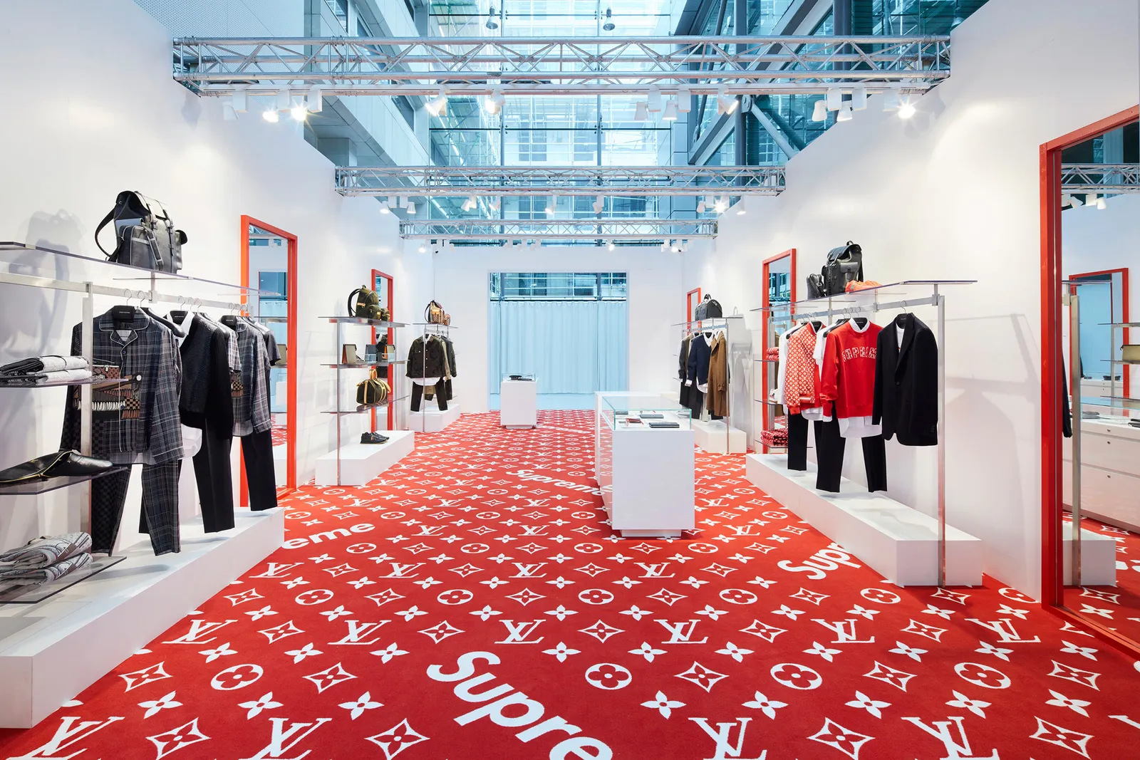
Two details are worth pulling out, because this is the part founders usually miss.
It was an exchange, not a favour. Louis Vuitton wasn't being charitable. It got access to a younger, hype-literate audience it had struggled to reach and a cultural relevance no amount of advertising buys. Borrowing works best when it runs in both directions. If you're approaching a partner with nothing to offer but proximity, you're asking for a donation, and it will show in the terms.
The equity outlived the drop. The product sold out in days, but the association stuck. Supreme's later valuation and its acquisition by VF Corporation, and then Supreme's onward sale, all sat on a story that this collaboration helped legitimise. A single well-chosen partner can permanently reposition how a category sees you, which is why the choice of partner matters far more than the size of the activation.
The takeaway for a smaller brand: you don't need a Louis Vuitton. You need one association your market already respects, whether that's a client logo, a stockist, a publication, a founder you've worked with, or a partner brand one tier above you. Then you place it where people will see it.
Visual codes: the luxury fragrance playbook
Want to be read as a luxury fragrance? Don't shoot the bottle on a clean white background. Surround it with marble, low golden light, silk, deep shadow, the imagery the eye has been trained to read as expensive for the last hundred years.
You haven't used the word luxury once. Every visual cue is doing it for you.
The reason this works is that categories accumulate a shared vocabulary over decades, and audiences learn to read it without ever being taught. Serif type, generous white space and restrained colour read as considered and expensive. Bold sans-serif, high contrast and dense layouts read as cheap and urgent, which is exactly right if you're a discount retailer and exactly wrong if you're charging a premium.
Two things make the difference between using these codes well and looking like a copy.
Precision beats volume. Luxury codes are subtractive. One material, one light source, one idea per frame. The common failure is a founder who wants to look premium and adds gold, adds a serif, adds a script logo, adds a monogram, and ends up looking like a hotel buffet. If you're borrowing restraint, you have to actually be restrained.
The rest of the experience has to hold. Visual codes set an expectation, and every subsequent touchpoint either confirms or breaks it. Luxury photography followed by a default Shopify checkout, a jiffy bag and a template confirmation email doesn't read as premium, it reads as a brand that got caught. Borrowed cues raise the standard you're then held to.
Cultural reference: Off-White and Aimé Leon Dore
Two brands, same mechanic, very different sources.
Off-White: borrowing from another discipline
In its early years, Off-White wasn't just designing clothes. Virgil Abloh borrowed the visual language of industrial design and logistics: shipping warehouses, hazard striping, safety tape, zip ties, and quotation marks placed around everyday words.
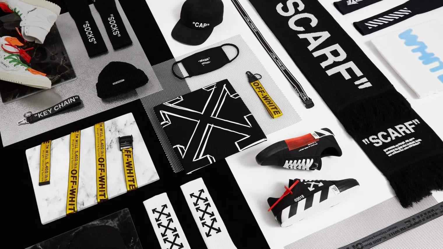
The quotation marks are the whole trick in miniature. Labelling an object with its own name in quotes is a straight lift from conceptual art, closer to Duchamp's readymade than to fashion. It reframes a hoodie as an art object with a reference behind it, and that reframing is how you support a £600 price on something a factory can produce for a fraction of it.
What makes it work is friction. Abloh took cues from a world with no glamour attached and applied them to a category obsessed with glamour. The mismatch is what makes it feel intentional rather than decorative. Borrowing from an adjacent, obvious source (a fashion brand borrowing from other fashion brands) reads as derivative. Borrowing from a distant one reads as a point of view.
Aimé Leon Dore: borrowing from nostalgia
Teddy Santis built Aimé Leon Dore as a love letter to 90s New York. Queens basketball courts, old Mercedes coupés, vintage Ralph Lauren, espresso bars, film photography, the specific warm grain you only get from a disposable camera.
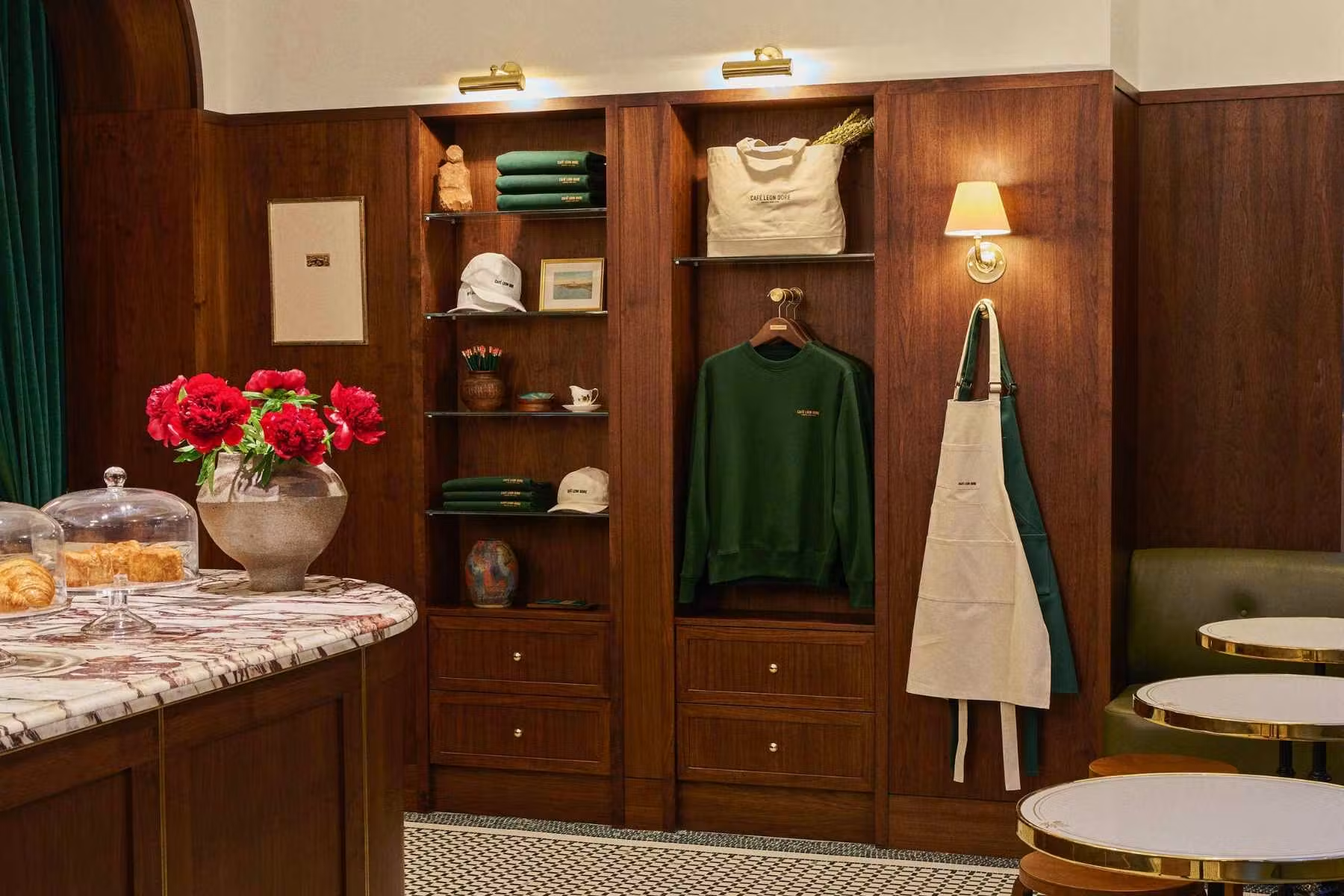
None of those references belong to him. He curated them with enough precision that buying an ALD crewneck stopped being about the crewneck. People pay for cotton because it makes them feel like they're stepping into a specific era and a specific kind of life, and that feeling does the work the product never could on its own.
Two layers underneath this one.
Nostalgia is the cheapest emotional shortcut available, and the hardest to fake. It works because the feeling is already installed in the audience. You aren't building it, you're triggering it. But the trigger only fires on specifics. "90s vibes" does nothing. A 190E in a particular colour, shot on a particular film stock, outside a particular kind of building does everything. Precision is the entire cost of entry.
You don't own what you borrow. Anyone can shoot on film outside a bodega. Brands built on cultural reference survive by adding something that is theirs, whether that's a product, a physical space, or a consistency of taste competitors can't sustain. If the reference is all you have, you'll be copied within a season.
Category transfer: Dyson
A vacuum cleaner is one of the least interesting objects in your house. Dyson borrowed its entire vocabulary from aerospace and high-end engineering instead.
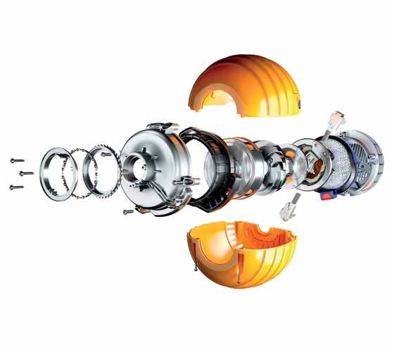
Transparent chambers so you can watch the cyclone work. Exposed components. Exploded-view technical diagrams in the advertising. Language about airflow and motor speed. The product didn't need to be aerospace technology. It needed to look and feel like it was, and that's how you sell a vacuum at £600 while everyone else fights over the £80 shelf.
The clever part is that Dyson borrowed proof, not just style. The transparent bin isn't a design flourish, it's a visible demonstration that the thing is working, and it made an invisible benefit into something you could point at. If you can find a way to make your product's actual advantage physically visible, you get the association and the evidence in the same move.
Worth noting: this only holds because the engineering is real. Category transfer is the highest-risk form of borrowing, because you're inviting comparison with an industry that is genuinely rigorous. If the substance underneath doesn't survive that comparison, the borrowed credibility turns into a liability the first time someone tests it.
Where this goes wrong
| Failure | What it looks like | Why it fails |
|---|---|---|
| Borrowing above your delivery | Premium codes, budget experience | The gap becomes the story |
| Borrowing the obvious | Looking like the category leader | You reinforce them, not you |
| Borrowing too many things | Three references in one campaign | No single association lands |
| Borrowing a liability | A partner or subculture that turns | Equity runs both ways |
The last one deserves attention. Association is not risk-free. Whoever you stand next to, you're accepting some of their reputation along with their equity, and you don't control what they do next.
Audit what your brand is standing next to
Before you spend another penny on ads, work through this honestly.
| Question | What it reveals |
|---|---|
| Which brands appear in the same frame as yours: partners, clients, stockists, logos on the site? | Your borrowed status |
| What does your typography remind people of? Which category uses it already? | Your default reading |
| Where and how is your product photographed, and what else gets shot that way? | Your perceived tier |
| Who is cast in your imagery, and what life do they appear to live? | Your aspirational anchor |
| What does your packaging, checkout or invoice feel like next to the homepage? | Whether the borrowing holds |
Score each one against the position you're trying to hold. Anything pulling downwards is quietly setting your price.
The takeaway
The product rarely changes as much as the price does. The associations around it do.
Your brand is already borrowing meaning from something. Fonts, photography, people, places, the other names in the frame. Whether that borrowing was designed on purpose is the only variable you actually control, and it's usually cheaper to fix than a media budget.